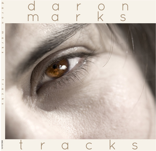
ctan here! To quote from chapter 624 “How to be a Millionaire“, in which Daron and Remo visit Artie’s office at Wenco, and Artie shows Daron what the album cover will look like for his instrumental solo album:
Remember back when I went to take those promo photos? What we’d discussed was that my photo was for the back of the album while they were going to use some kind of nature photography on the front, which was their standard thing.
They had decided not to do the nature thing.
They had used a closeup of my face, so close that the only thing you saw on the CD cover/album cover was one of my eyes, and most of my cheek, where in the photo you could really see the fine tracks of the scars that had been made by the stage explosion. On the back was a little inset photo of the Ovation in a stand in the studio. And in lowercase letters, spaced far apart so that my name spread across the width of the album:
d a r o n
m a r k s
t r a c k s
Well, I was too braindead to write the other night, and so I bought the stock art to make this a reality. Technically it’s not “fan art” since I did it, but you know, I’ve always just considered myself the #1 fan of Daron’s, so count it as whatever you wish. 🙂
I also didn’t attempt to actually represent the fine-line scars so you’ll have to imagine that part. (Honestly they’re only really obvious on his face when you really look for them. Or blown up to the size of an album cover, I guess.)
Click on the thumbnail to see it full size! And check under the cut for more views and for a small playlist of music…
As for what this album sounds like, I can only offer things that bear some resemblance, like Trace Bundy’s “Bristlecone”, Estas Tonne’s “The Song of the Golden Dragon,” and the great Ottmar Liebert’s “Snakecharmer” acoustic version. Here are those three songs in a Youtube playlist:
(If I get a chance I will add more songs to the playlist but these three are really on target.)
Front only:
Back only:
Photograph of eye closeup © Mario Lopes | Dreamstime.com


14 Comments
I love the track titles.
I think side one is all ocean-themed; side two is a bit more random.
Gah. Lost my comment in enlarging the photo.
I love this, and I love it more knowing it’s something you put together since you don’t usually do graphics. That makes it a great treat and absolutely counts as part of the Thursday fanworks.
When I first wrote the description of what the album looked like, I didn’t have any photos at all, just an idea in my mind. But then one day I was trawling through stock photo site and came across the eye closeup by luck.
<3 thanks for this, ctan. It's beautiful.
Yr welcome!
This is ridiculously gorgeous!!!!!! I love the spot colour on the front, and the names of the songs are very evocative!
Glad you like it! 🙂
Considering the Trace Bundy album is one of my top ten most played… this would be too. If only I could get my hands on it! Sigh 🙂
What a beautiful album cover.
I can’t remember where I first heard Trace Bundy, but he’s now a staple in my playlists!
The Wenco copyright info in the corner and on the spine is PRICELESS 😀
Realistic, no?
I love this! Glad you took the time to do it.
Me too! 😀 (I procrastinated from doing other work…heh)